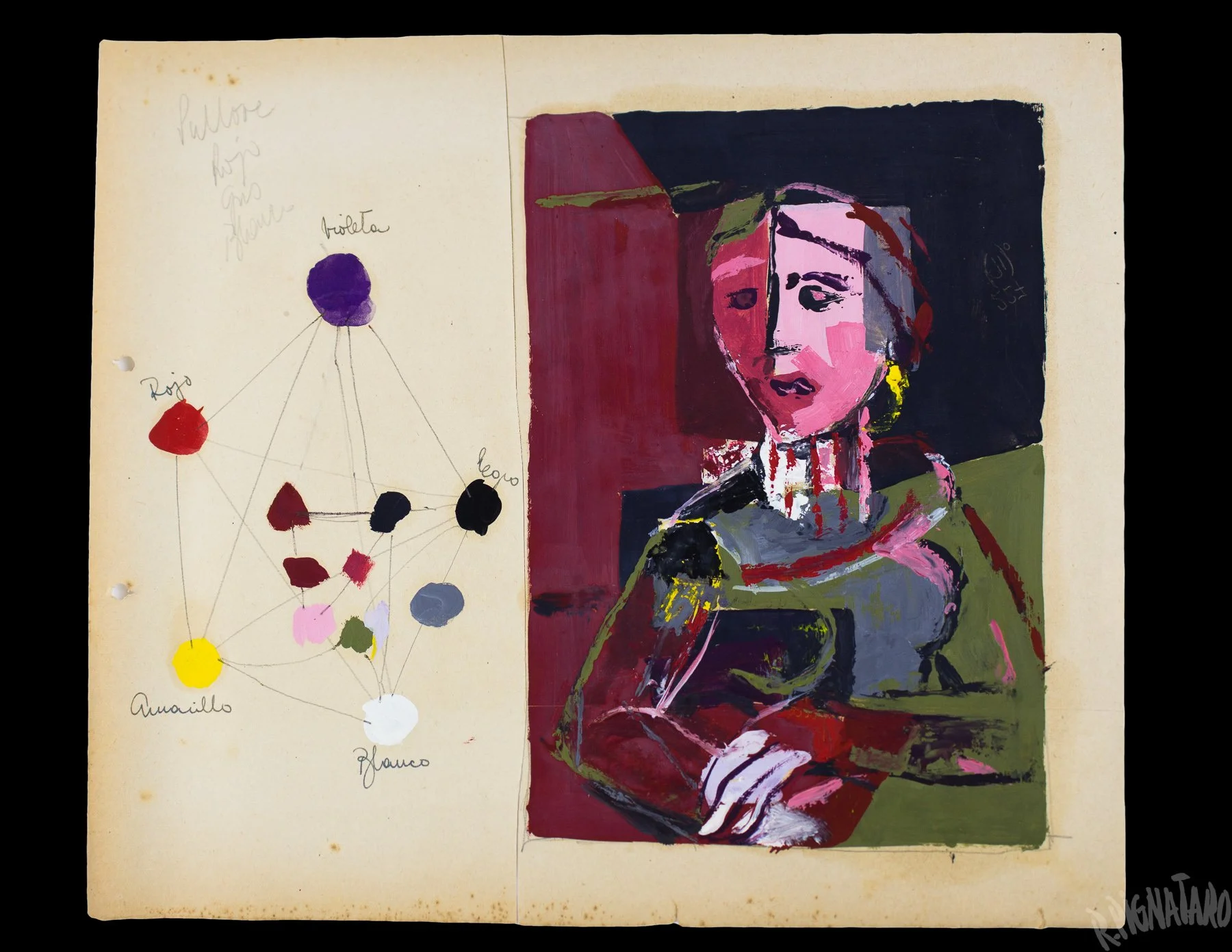
▲ Roberto Pignataro, Artwork № 227, c. 1958. Oil paint on paper, 35.5 × 25.5 cm.
Throughout his artistic career, Roberto Pignataro experimented with multiple abstract styles and compositional techniques. So much so that, at times, works from different periods are hard to recognize as the work of the same artist. Yet beneath these shifts, certain color themes continued to reappear as a unifying thread, most notably pinks, reds, oranges, whites, and earthy tones.
This article focuses specifically on Pignataro's use of pink, tracing its emergence during his art school years and its recurring appearance throughout his exhibition period as a powerful vehicle for visual and emotional expression.
•••
Early Years
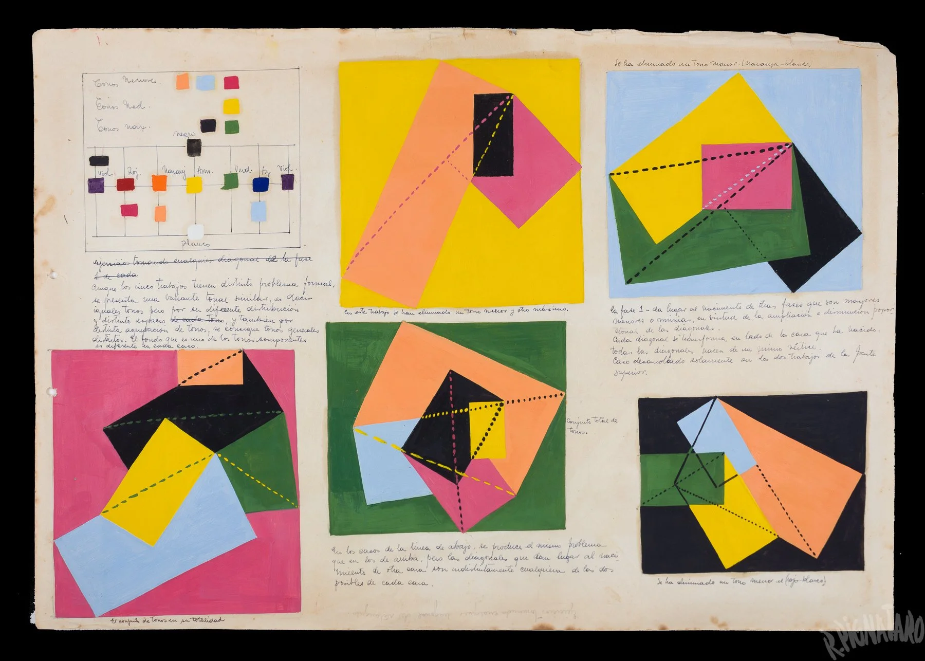
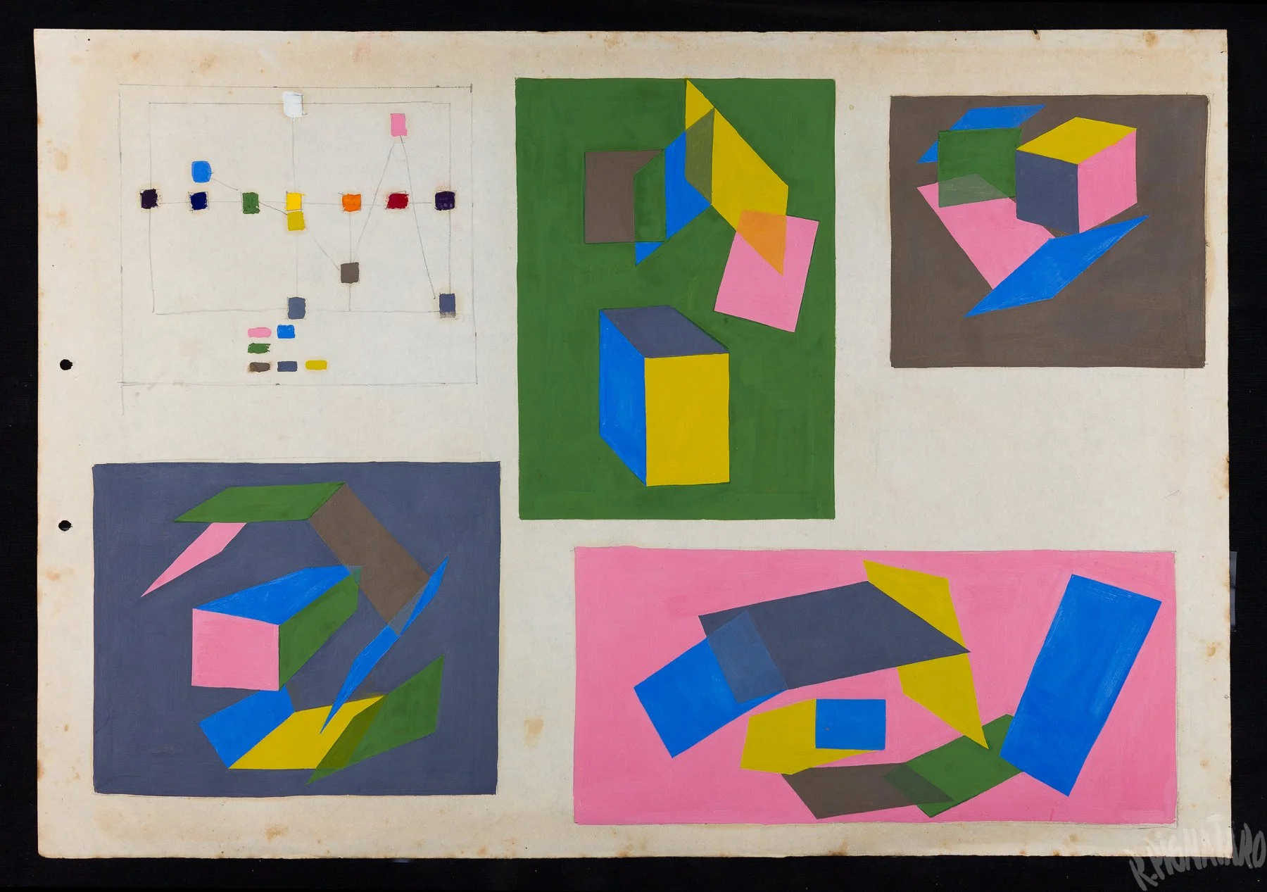
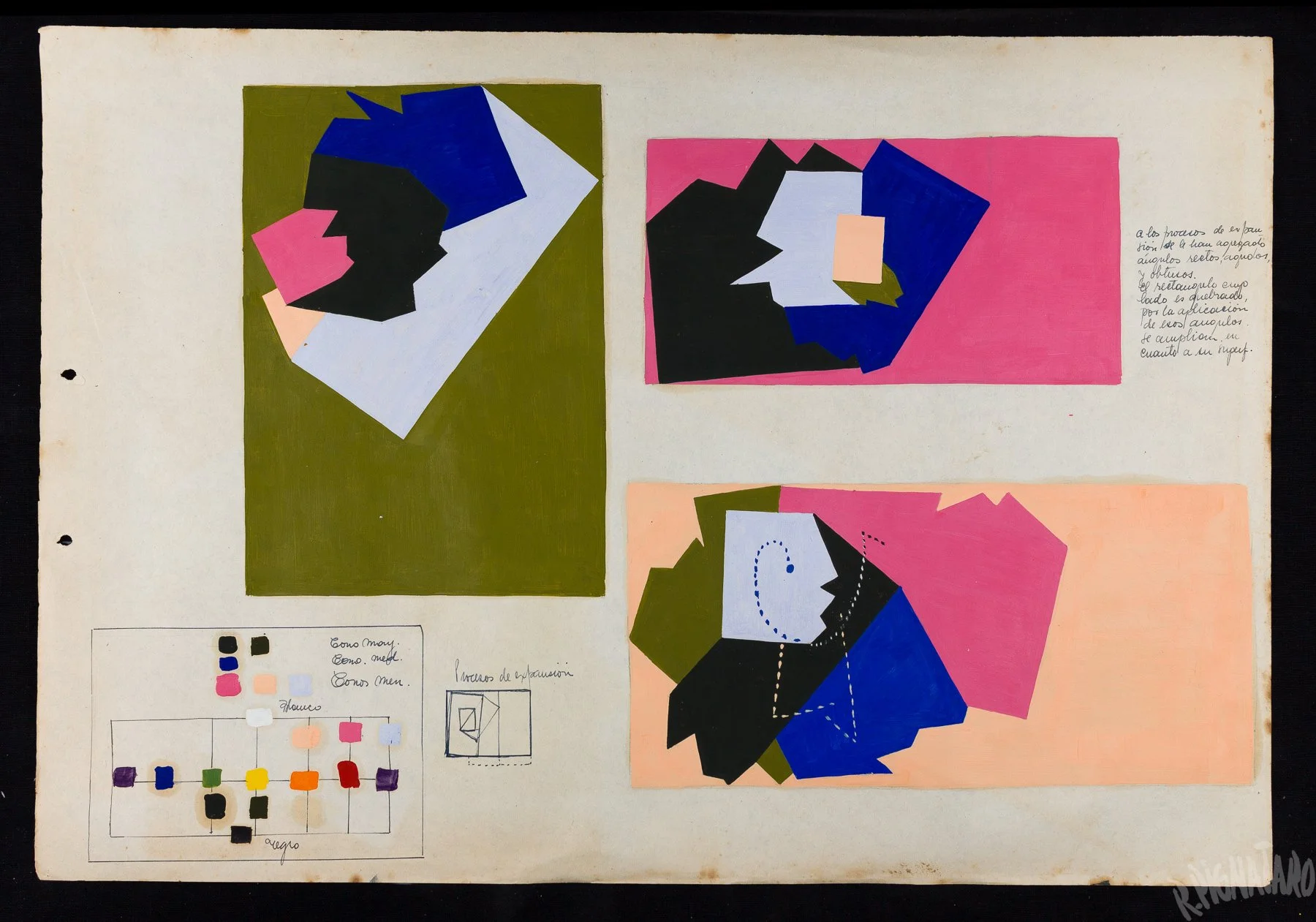
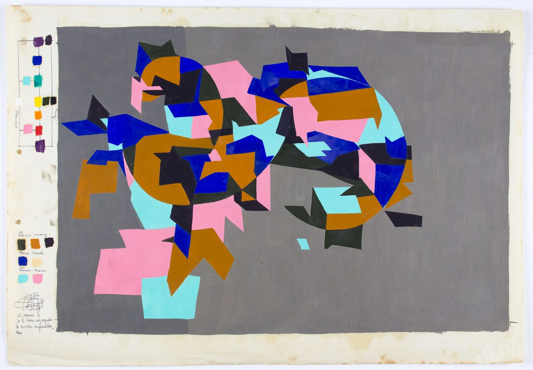
The works above show an earlier use of pink in Pignataro’s art school period, around 1958. At this stage, the color is already present across several paintings, but it still functions as one element within a broader exploration of color, form, and spatial relationships.
The painting below, however, marks the first instance where pink begins to move beyond a supporting role, emerging instead as a dominant force and defining the mood, structure, and presence of the composition.
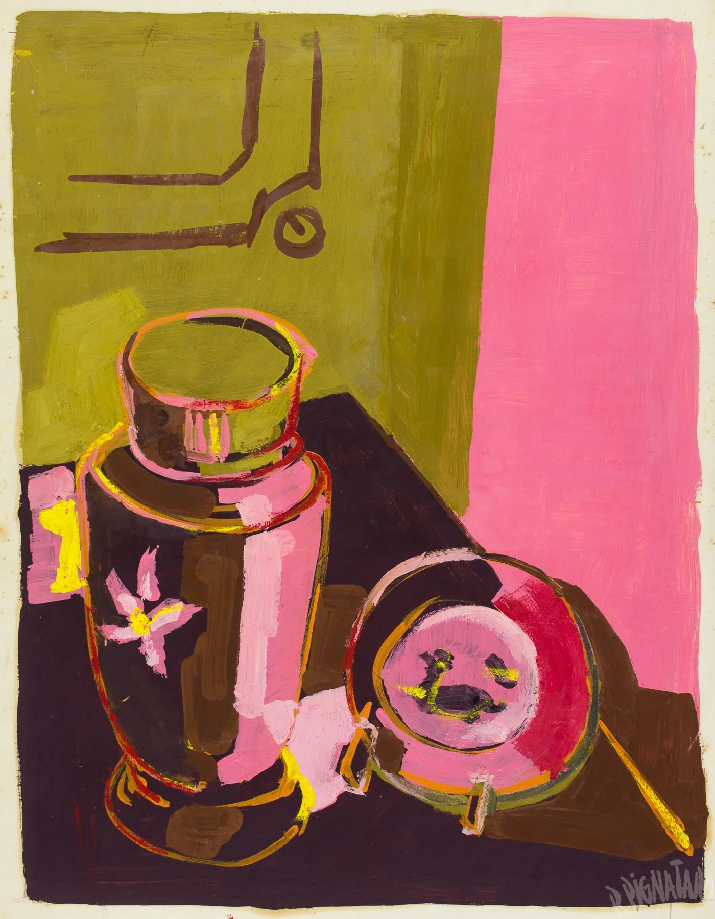
▲ Roberto Pignataro, Artwork № 189, c. 1958. Oil paint on paper, 46.5 × 35 cm.
By 1959, Pignataro was moving fluidly between two distinct visual languages: loose, organic compositions with suggestive figurative elements, and a more rigorous geometric abstraction. The work below belongs to the latter, with pink playing a central role in shaping the character of the composition.
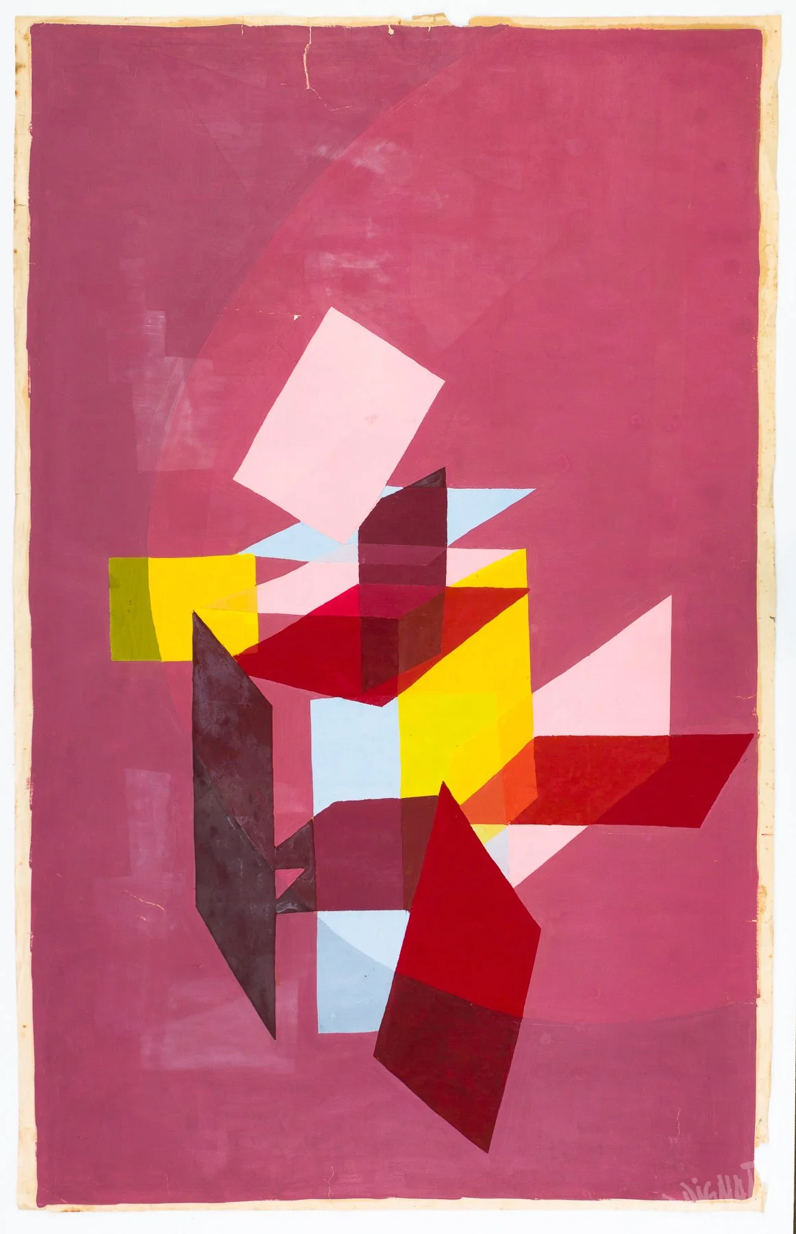
▲ Roberto Pignataro, Artwork № 40, 1959. Oil paint on paper, size: 82 × 51.5 cm.
The 1960 work below marks a notable technical shift. Pignataro moves from oil paint to paper collage while preserving the same geometric vocabulary. Despite the change in medium, his attraction to pink clearly carries over, helping to organize the composition while retaining much of its expressive power.
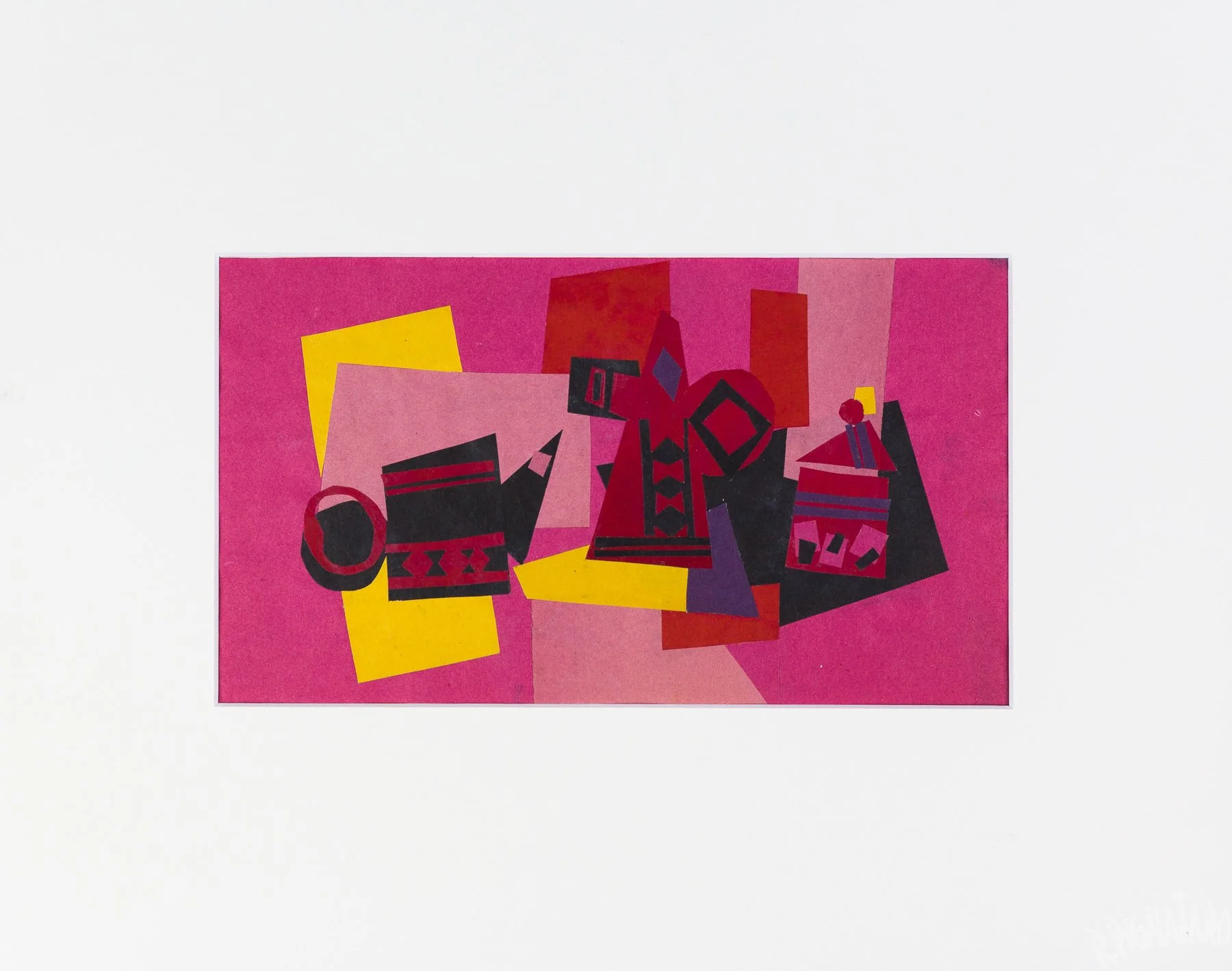
▲ Roberto Pignataro, BA-27, c. 1960. Paper collage, 22 × 12.5 cm.
Of course, the works examined so far were not produced sequentially. Many other paintings came in between, as Pignataro explored different color themes not involving pink. Yet it is remarkable how consistently the color returned to his work, establishing a pattern that would continue—perhaps less frequently, but still unmistakably—into his exhibition years.
•••
Exhibition Work
Much like during his art school years, the works Pignataro produced for exhibition sometimes feature pink in subtle, supporting roles. At other times, however, the color emerges in full force, dominating the energy and visual narrative of the composition.
The two examples below demonstrate the former. Each piece belongs to a different 1964 exhibition—Pignataro held two that year. This period represents perhaps the peak of his most Abstract Expressionist phase, when his work took on a particularly intense character, seemingly absorbing some of the psychological unease, social tensions, and political instability that surrounded Argentine society at the time.
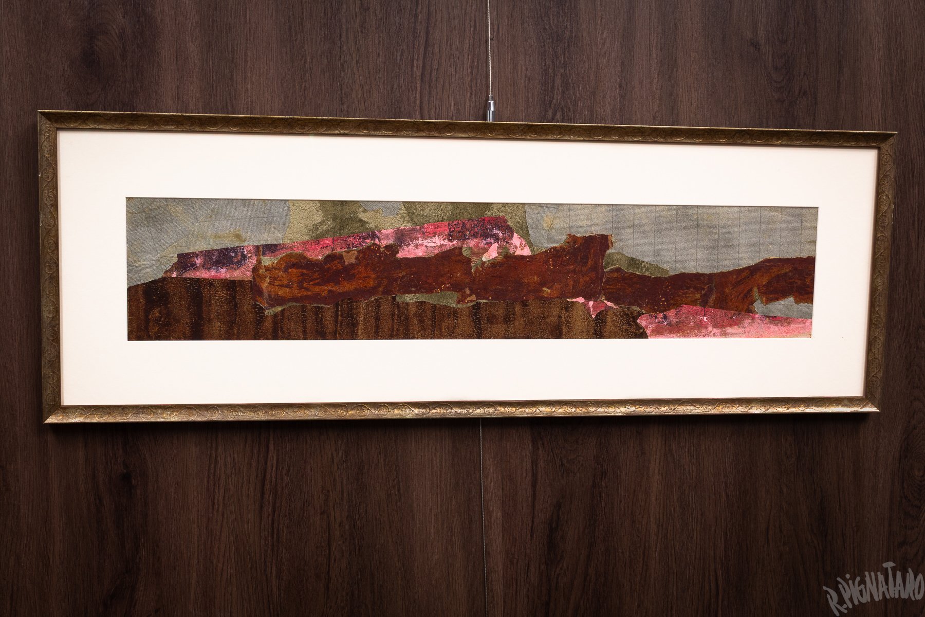
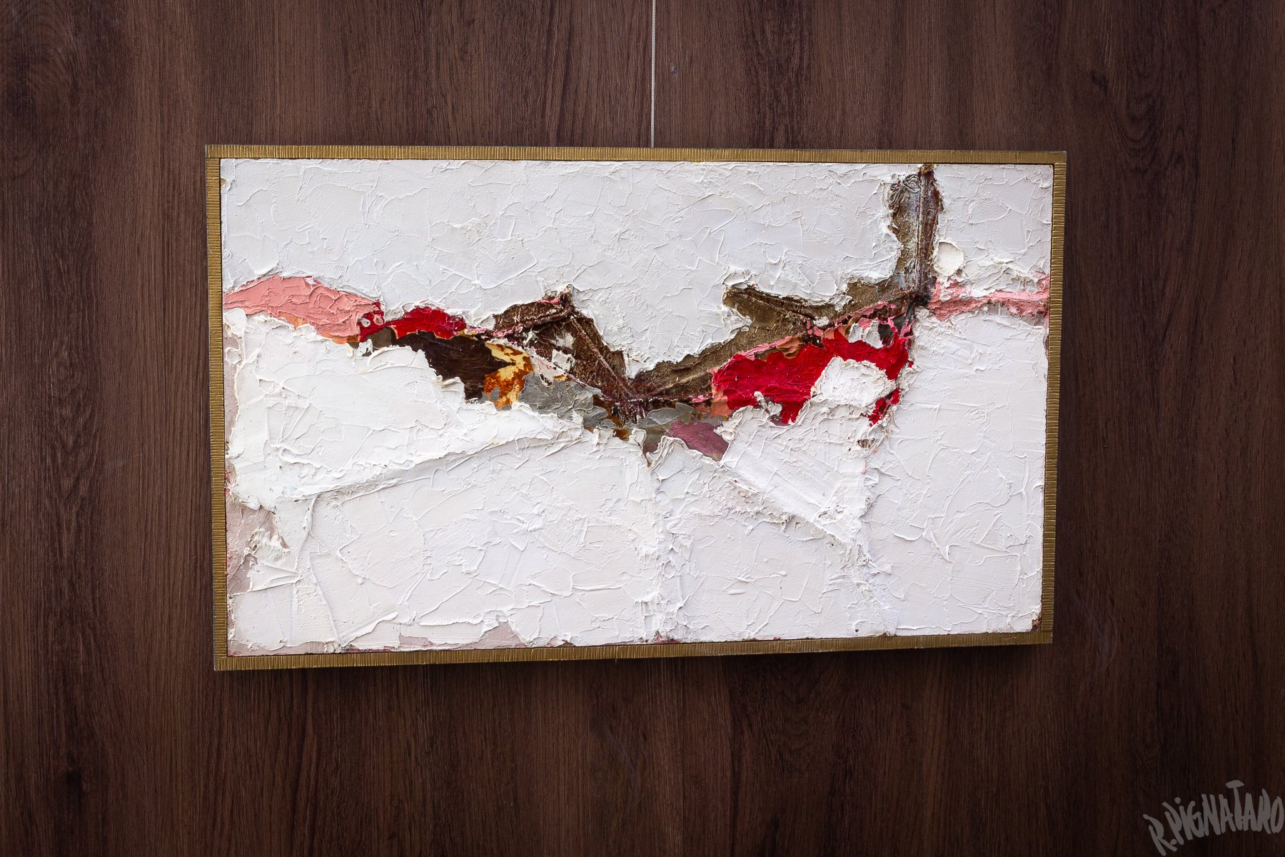
Yet even within these rugged compositions of torn materials, heavy impasto, earth colors, and aggressive textures, pink repeatedly enters the picture to provide an unexpected counterbalance, making these intense works more emotionally complex, yet more approachable.
The two diamond-shaped collages below belong to a series exhibited in 1968. Although these particular pieces were not included in the exhibition, they remain among my favorites from the series. They are great examples of pink used as the dominant color, making these otherwise highly abstract compositions more visually inviting and easier to engage with.
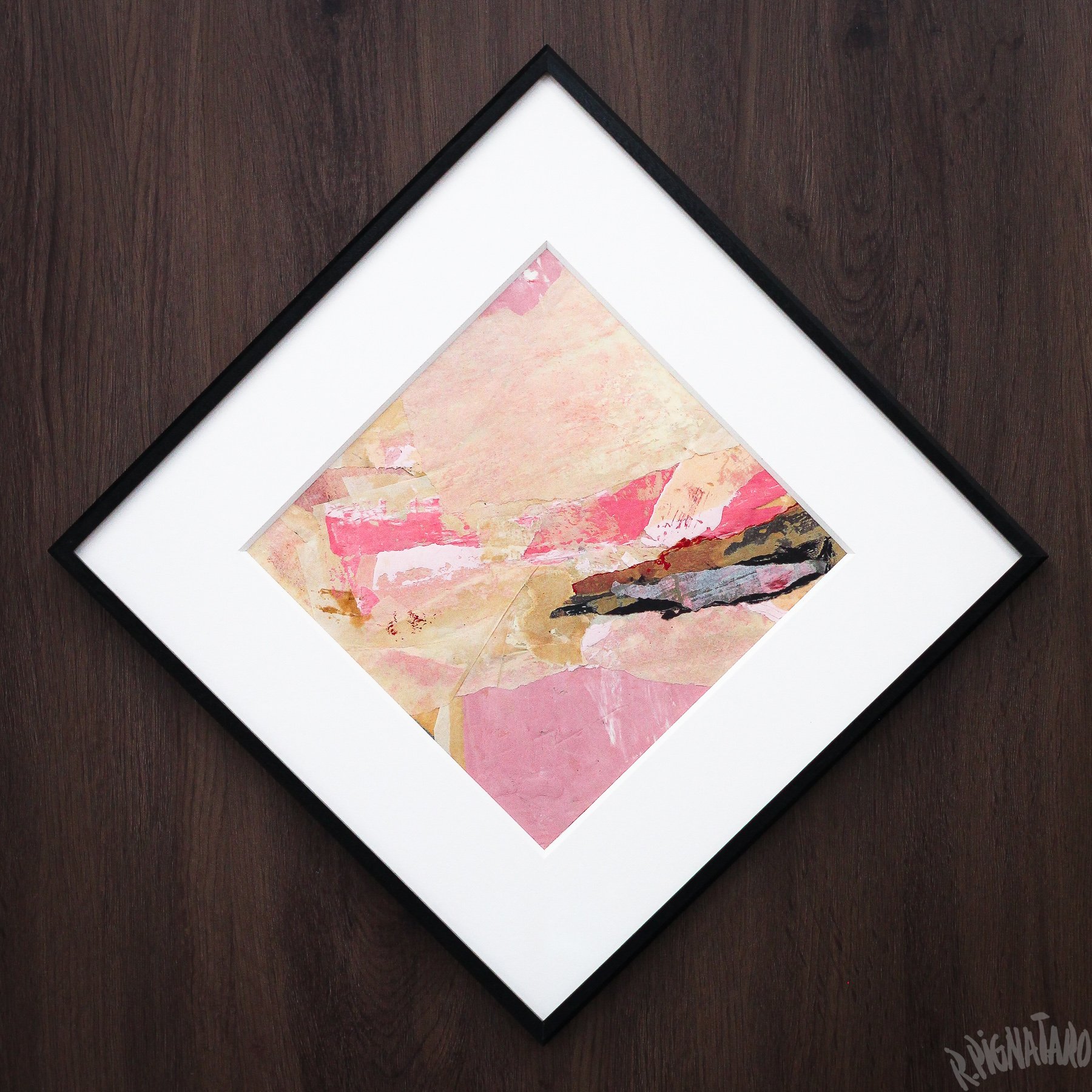
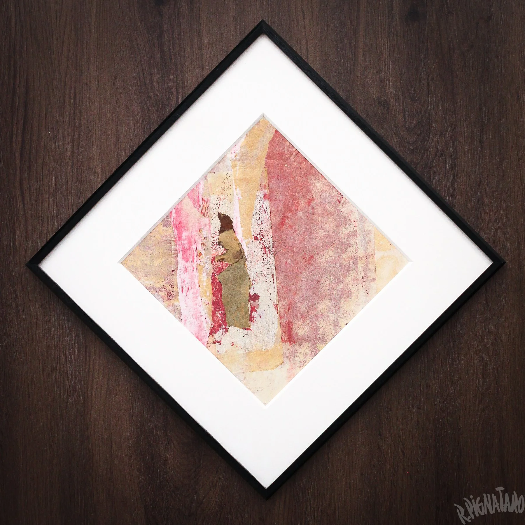
The two works below are from a 1970 exhibition at Galería Lirolay. Together, they provide a great example of the broad expressive range Pignataro could draw from pink. These works also coincide with an important moment in Pignataro's personal life: his wife was pregnant with their first child—a girl.
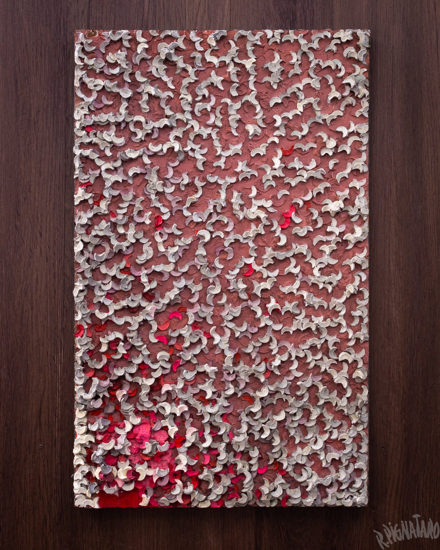
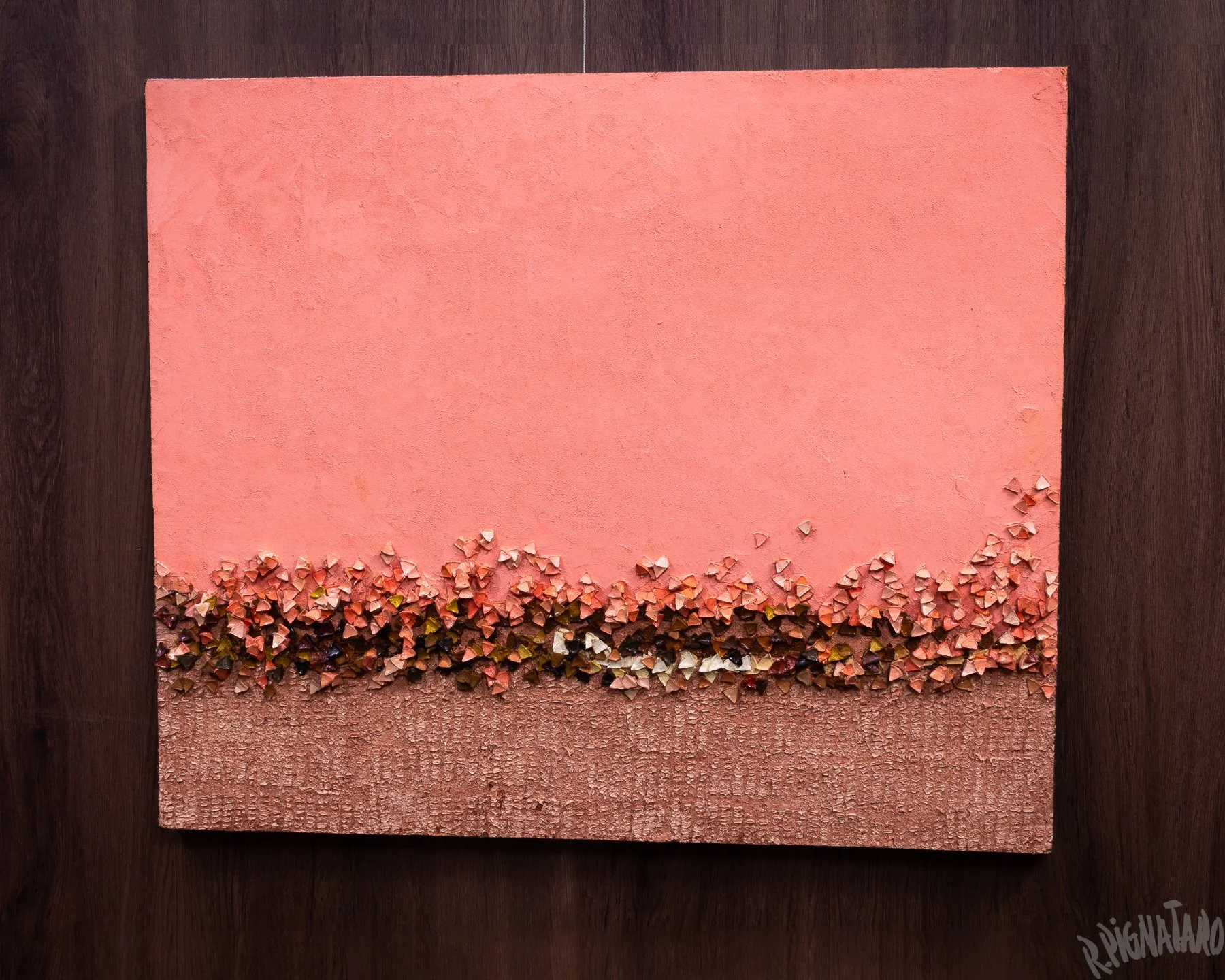
Whether the arrival of his first daughter had any direct bearing on the paintings is hard to say, as Pignataro never explicitly made such a connection. Still, given the warm and expansive character of these compositions, the coincidence is hard not to notice. It is possible that some of the anticipation and emotional changes surrounding impending parenthood found their way, consciously or otherwise, into the work.
The four-panel piece below belongs to a series of abstractions exhibited in 1972 at Galería Lirolay. In this show, Pignataro continued exploring colorful, three-dimensional compositions. Here, the expansive pink background sets a playful tone, providing a lively setting for the small animated motifs that emerge along the lower edge.
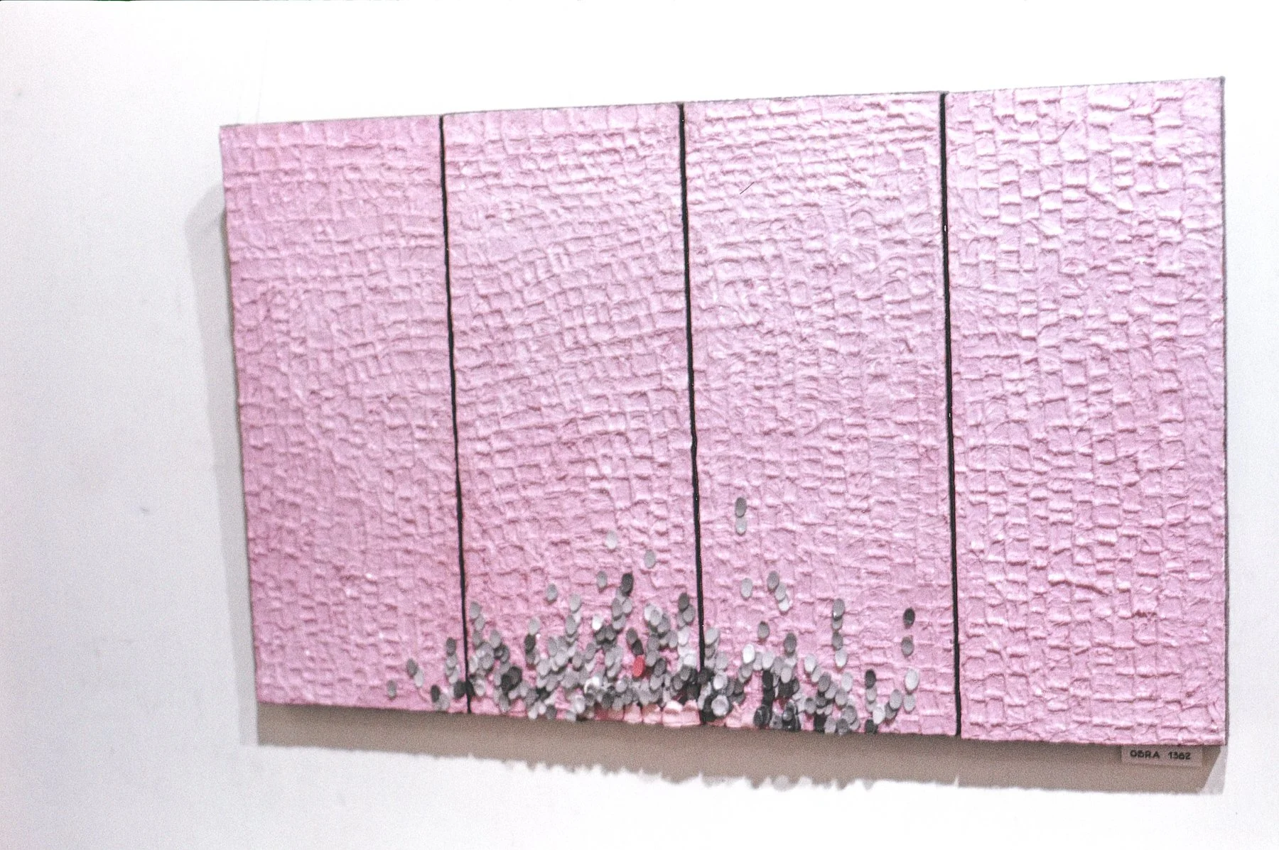
▲ Roberto Pignataro, Artwork № 1382, 1971. Oil on hardboard, 41 × 60 cm.
The piece below belongs to another colorful series of abstractions exhibited in 1973 at Galería Lirolay. At just 25 × 15 cm (a little under 10 × 6 inches), this one was the smallest of the series—almost a miniature work. Here, Pignataro places pink into a grid-like system, where a range of related tones—from pale rose to deeper mauves and warmer salmon—are broken into individual squares, forming a larger composition around a sun-like motif and once again conveying a warm and playful mood.
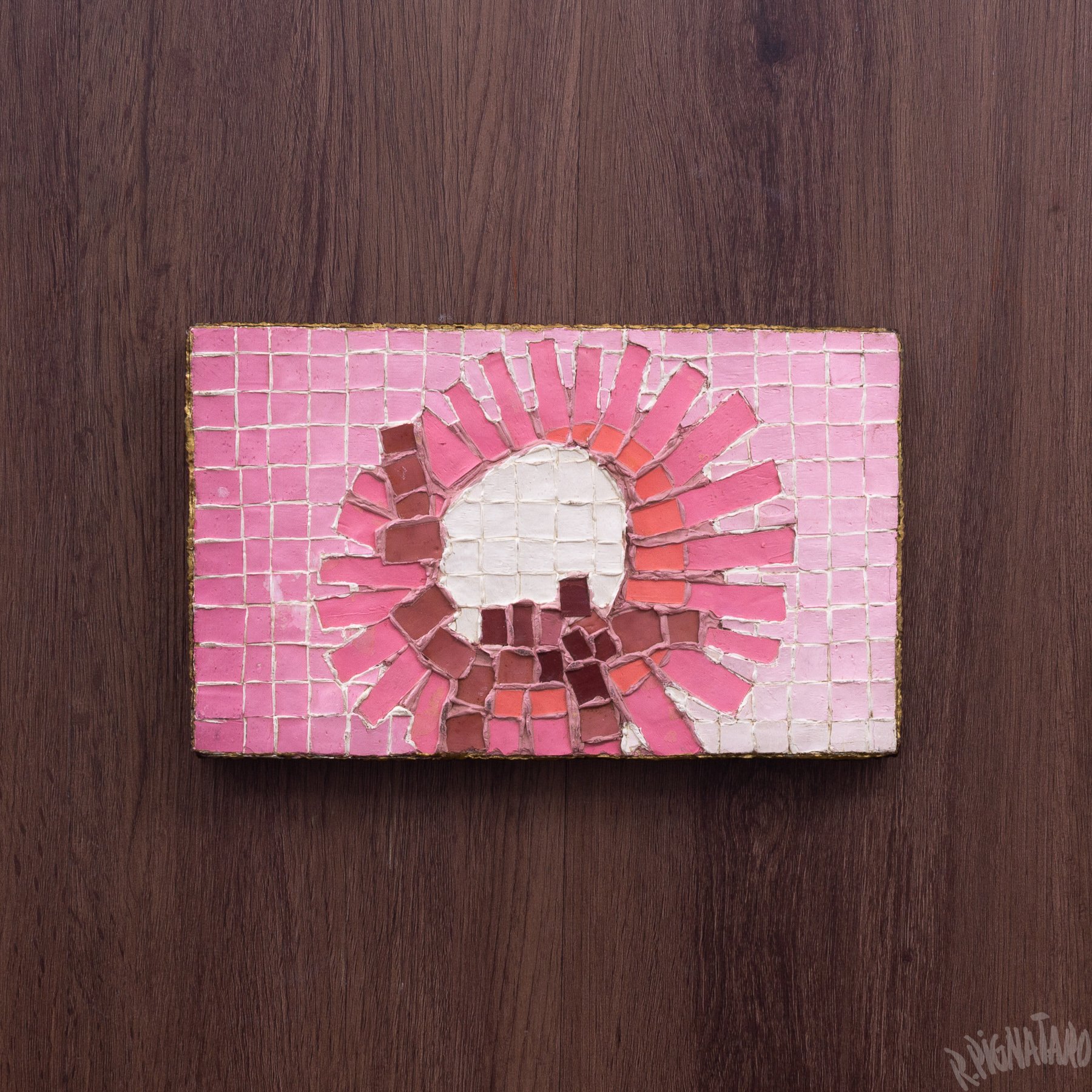
▲ Roberto Pignataro, Artwork № 1476, 1972. Oil paint on hardboard, 25 × 15 cm.
The collage below is from a 1977 exhibition at Galería Lirolay. By this period, Pignataro’s work had become increasingly colorful and animated, marking a dramatic departure from the intense Abstract Expressionism of the early 1960s. While the series explores diverse color palettes, pink continues to have an important presence in its visual language.
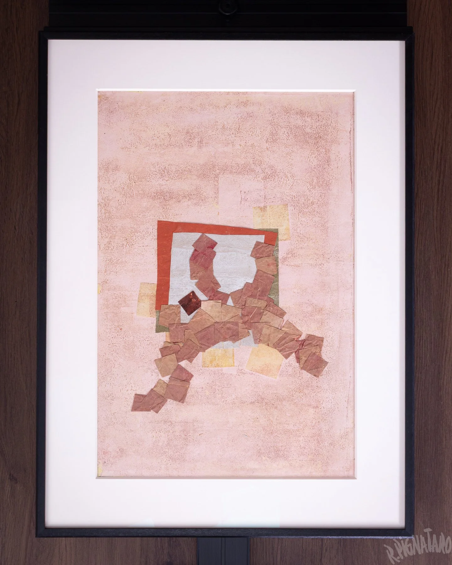
▲ Roberto Pignataro, Artwork C.O. 559, 1976. Oil and paper collage on construction paper, 65 × 50 cm.
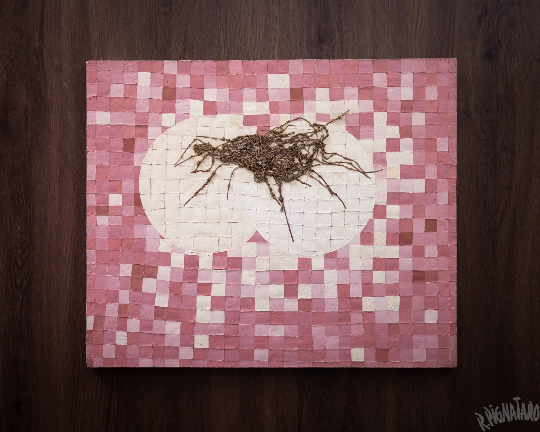
The painting below is from Pignataro’s final solo exhibition, held in 1979 at Galería Lirolay. The exhibition presented six works built around similar grid systems, creating an interesting contrast with lively organic motifs made from sisal thread. These grids, which Pignataro had explored in different forms throughout the decade, bear an intriguing resemblance to the pixels of a digital screen—a resemblance perhaps nowhere more compelling than in this series.
•••
Final Thoughts
Pignataro’s relationship with pink becomes particularly interesting when considered within the cultural context in which he came of age. Growing up in Argentina during the 1930s and 1940s, and reaching adulthood in the late 1940s and 1950s, he belonged to a society shaped by strong conservative structures, authoritarianism, and rigid expectations of masculinity.
Even within the more open-minded environment of the mid-century art scene, pink sat somewhat uneasily beside the muscular visual language often associated with postwar gestural abstraction. Yet Pignataro not only embraced the color, but did so unapologetically; he repeatedly gave it a leading role in his abstractions, drawing fully on its expressive power to communicate beyond the limits of form and subject matter.
Pink, of course, is only one part of a much larger story. In future articles, I hope to explore Pignataro’s relationship with other colors and the recurring palettes that accompanied different periods of his artistic career.
About the Artist
Roberto Lucio Pignataro (1928–2008) was an Argentine abstract and Informalist painter active in Buenos Aires between the 1950s and early 1980s. His work explored texture, material presence, color, and non-representational visual language across painting, collage, and assemblage.
Research Context
This article forms part of an ongoing archival project documenting the artistic career of Roberto Pignataro and examining recurring themes, techniques, materials, and visual ideas across his body of work.
Topics Covered in This Article
Roberto Pignataro, Argentine abstract art, Argentine Informalism, color in abstract art, pink in abstract painting, color symbolism in art, expressive use of color, color and emotion in painting, Abstract Expressionism in Argentina, postwar abstraction, Buenos Aires art scene, Argentine art of the 1960s, Argentine art of the 1970s, collage and assemblage, geometric abstraction, gestural abstraction, color in collage, pink color palette, abstraction and color theory, Galería Lirolay, mid-century Argentine art, modern Latin American art, Roberto Pignataro paintings